Updating a girls' room to welcome her brother
Another finished space needs rethinking!
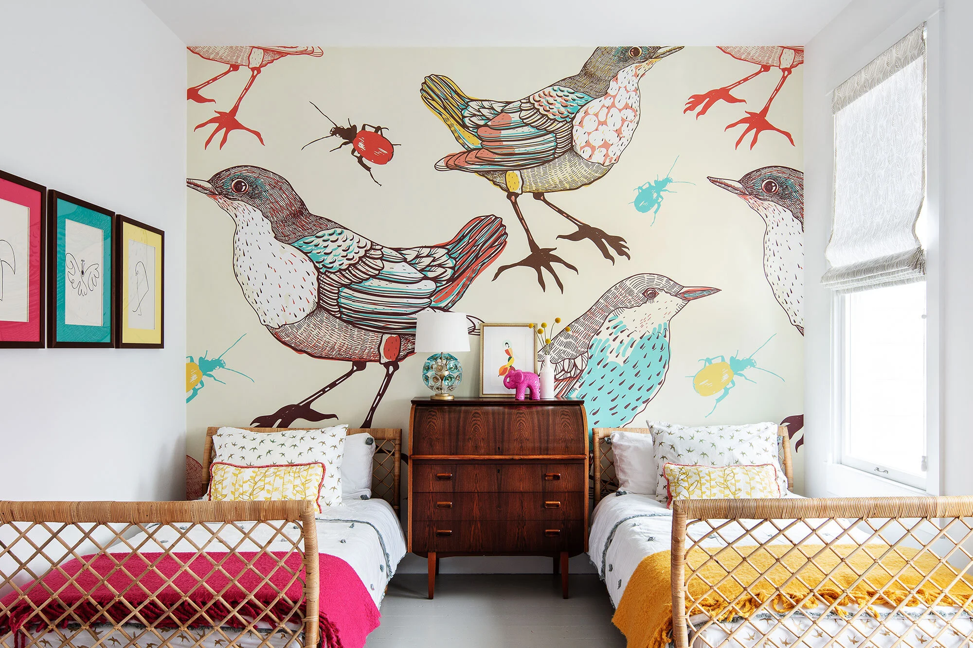
This little room has had a big place for me. It was featured on House Beautiful’s instagram to promote the digital story about this house. It gained me more than 500 new followers and was reposted dozens of times. In March, it graced the pages of House Beautiful’s print magazine, which was a real bucket list moment.
The room was designed for a 2 year old girl when there was no sibling in sight. Since then, a baby brother has joined the family, and while he was in a small nursery for the first year, his parents are looking to move him into his sister’s room.
You may not know that I was a creative writing major in college. I had a knack for pouring out gorgeous sentences and paragraphs in my first draft, making it very difficult for me to edit my pieces. I was always afraid that, when I took apart the components and tried to put them back together (to strengthen the plot or character development) I would lose the magic of that first draft where everything was quite natural and flowed.
Similar here. As an interior designer, how do you adapt such a beloved space to keep the magic but make it work for new needs?
Here is why I am a better designer than fiction writer: I have very specific strategies for why I put anything in a room. If you know the job an element is doing, you can pick another element to do the same work. (Writing was always more of a mystery to me—blind instinct!)
Let’s get down to it!
Step 1: Identify What Needs to Change
In this case, we want the space to feel more gender neutral, so out goes the overtly feminine choice.
So for example, no more pink rug or throw:
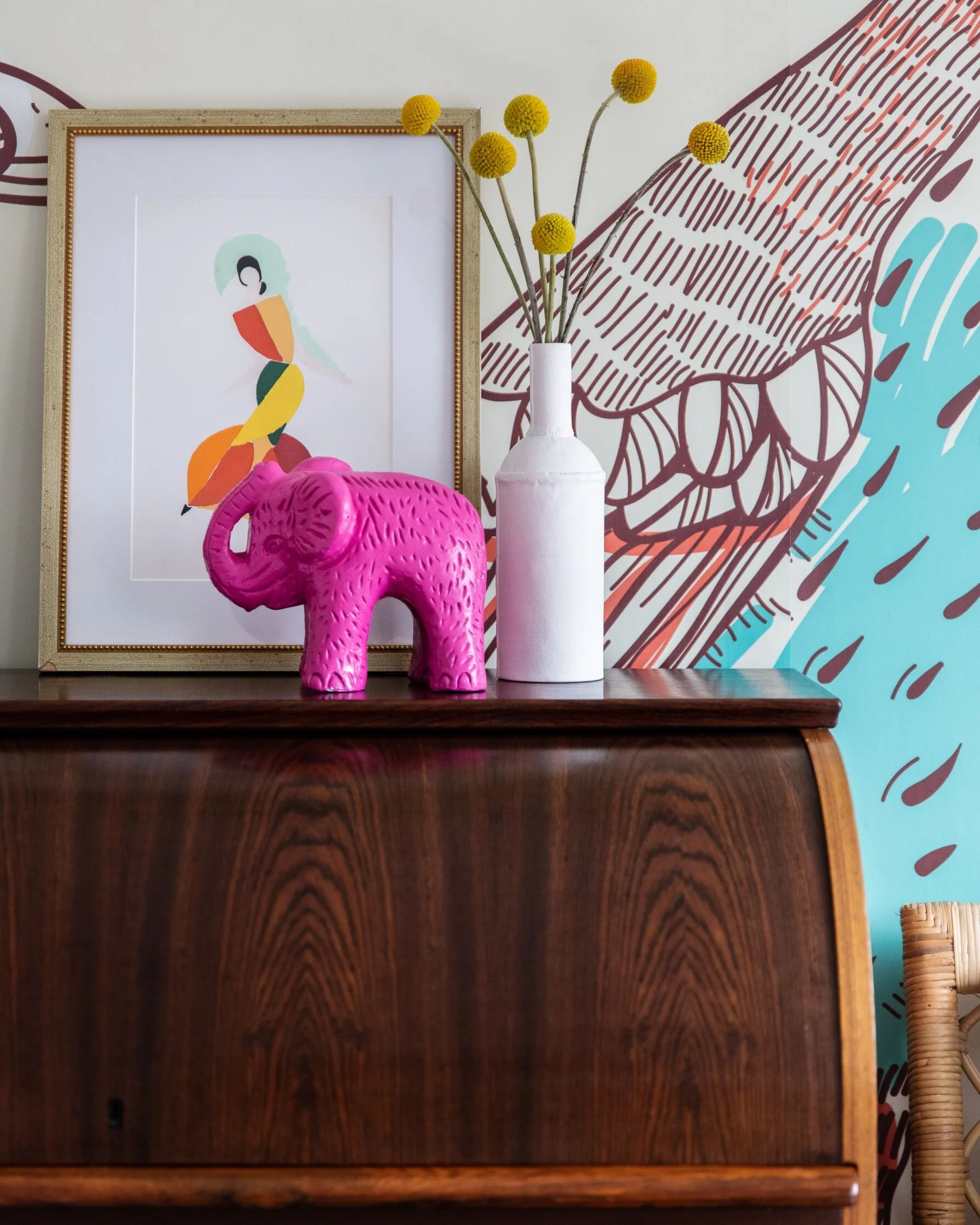
The art and small lamp on the credenza were too girly, as well
Step 2: Identify “the job” those pieces were doing
In this case, the rug was a modern take on a traditional persian rug. The front part of this house is a Victorian (read about it here), and we wanted to nod to the era of the home while connecting to the modern addition on the back half. to maintain that strategy but take the girly edge off, we proposed a vintage overdye rug in yellow or orange. Same idea, appropriate color shift.
On the dresser, the lamp is functional and needs to be small to fit. The leaning art was really just aesthetic—it broke up the mural a bit and gave visual balance to the lamp. To replace these, we sourced small-scale lamps in neutrals, and kid-friendly original art whose theme is universal.
Water is For wishing by Amy Rice
Step 3: Identify Function Changes
In this case, having two kids in here changes the function needs of the bedding. Originally the two beds matched, with the exception of the two throws (which the client already owned.)
With the client, we talked about how to differentiate the two beds and decided that keeping the matching sheets would be simplest from a laundry perspective, but we could mix it up with different colors on the same quilts, and individualized throw pillows. We also wanted to keep the custom lumbar pillows—the yellow vine pattern and orange an pink fringe still works. Because the mural is quite busy, we proposed patterened sheets and quieter quilts (which is exactly the strategy we used in the first place.)
Step 4: Put it all together
Here’s a peek at how the new elements work together!
Every bit as much fun as the original.
Are you stumped on a space that needs to transition? Tell me about it and we will see if we can help.


